Pill Keeper
What is the problem?
How can we enhance medication adherence and simplify daily routines for individuals
Solution
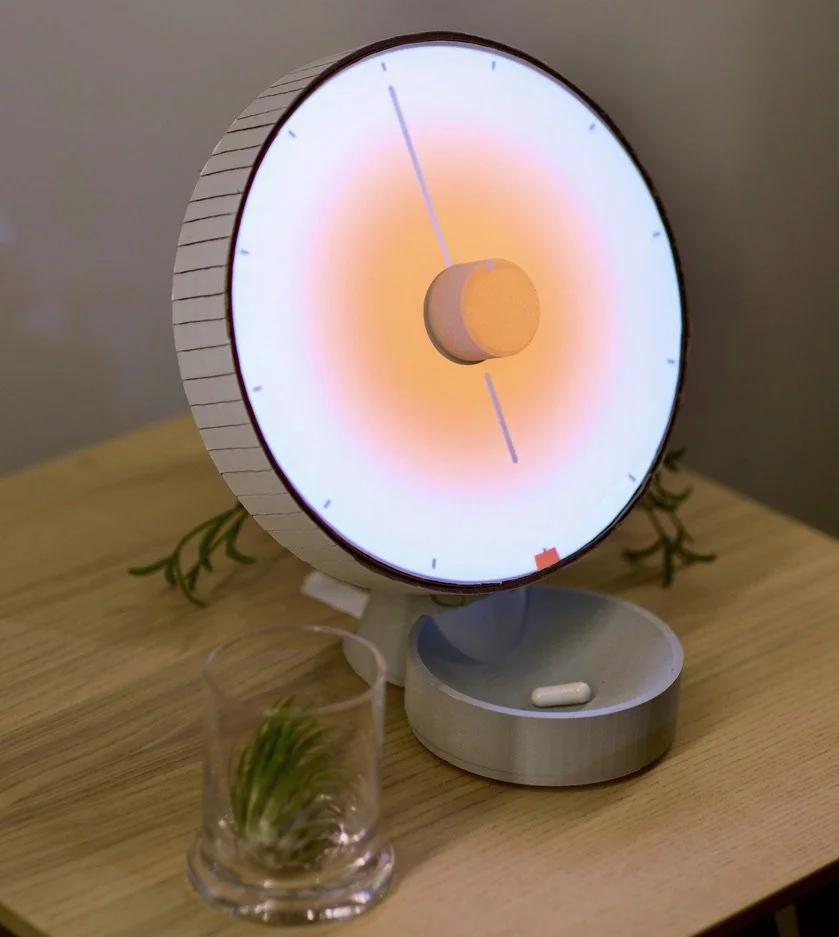
Pill Keeper nudges individuals to take their medication on time through a smart pill dispenser with simple tactile and engaging UI.
My Contribution
As the sole creator, I wore various hats in the development of the product by leading the research, ideation, prototyping, interaction design and projection mapping. I worked closely with my professor to make sure the design process stays on track.
Collaborators
1x Designers (Abed Darwazeh)
1x Instructor (Dave Elfving)
Why is this Significant?
Medication non-adherence, not taking prescribed medications correctly, is a big problem with wide effects. A 2017 study in the journal Circulation showed that not following medication instructions can double the chance of hospital visits for heart failure patients. I've seen this problem myself. My father, who needs several medications for his health, often forgets his pills, worsening his health conditions.
Process
The Problem
Traditional pill organizers have limitations including inflexibility, manual management, limited capacity, and lack of reminders, which can be problematic for patients taking multiple medications.
Initial Idea
I initially designed a smart pill organizer with traditional form factor and features such as reminders and automatic organization. However, upon review, I decided to start over with a new design.
Competitors
HeroHealth
HeroHealth is a pricey smart medication dispenser that uses an app to manage medication schedules and reminders, but its complexity may pose usability challenges for some patients.
MedaCube
MedaCube is a costly and sizeable smart medication dispenser with a digital interface for managing medication schedules and a 90-day storage capacity. However, its size, interface, and price may pose challenges for some patients.
Brainstorming
To begin brainstorming, I used a large sheet of paper to sketch out various designs for my smart pill dispenser, then I eventually abandoned the traditional boxy form factor commonly associated with pill organizers and dispensers.
To create a more distinctive and user-friendly device, I opted to combine a smart pill dispenser housed in a round clock and tray. This provides a tactile and straightforward solution for patients managing multiple medications. By departing from the traditional design, I achieved both functionality and aesthetics.
3D Modeling
To ensure that all the components fit together correctly, I created a 3D model of my smart pill dispenser based on my sketches. This allowed me to identify potential issues and make necessary changes before proceeding with 3D printing parts for the prototype.
Figma Prototypes
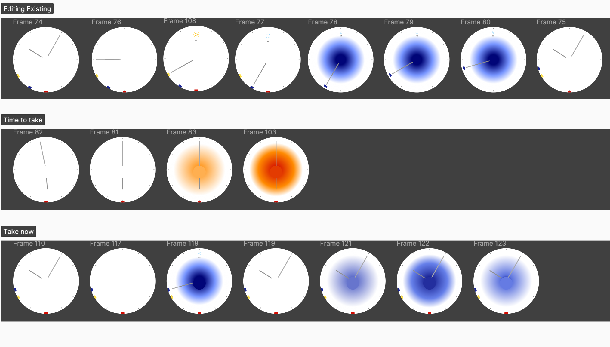
Initially, I included text notifications in the Figma prototype for my smart pill dispenser, but later removed them for a more streamlined design. Instead, I used a glowing clock screen as a visual cue to improve the device's user interface for patients managing multiple medications.
Physical Prototype
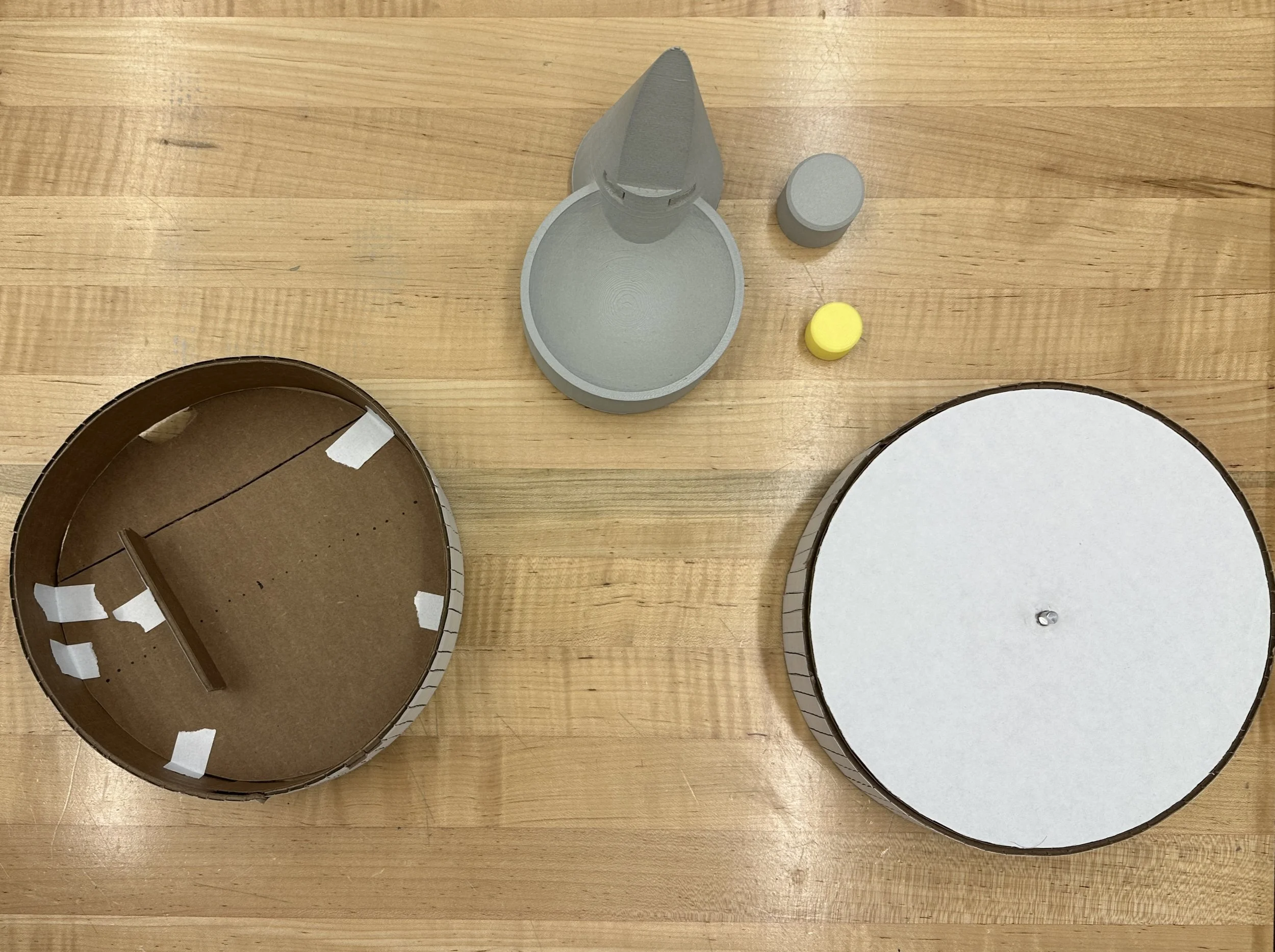
I used cardboard and 3D printing to create a functional prototype of my smart pill dispenser with a tactile user interface that is both intuitive and satisfying for users. Adding a real potentiometer and 3D-printed knob resulted in a user-friendly interface.
I used cardboard and 3D printing to create a functional prototype of my smart pill dispenser with a tactile user interface that is both intuitive and satisfying for users. Adding a real potentiometer and 3D-printed knob resulted in a user-friendly interface.
Projection Mapping
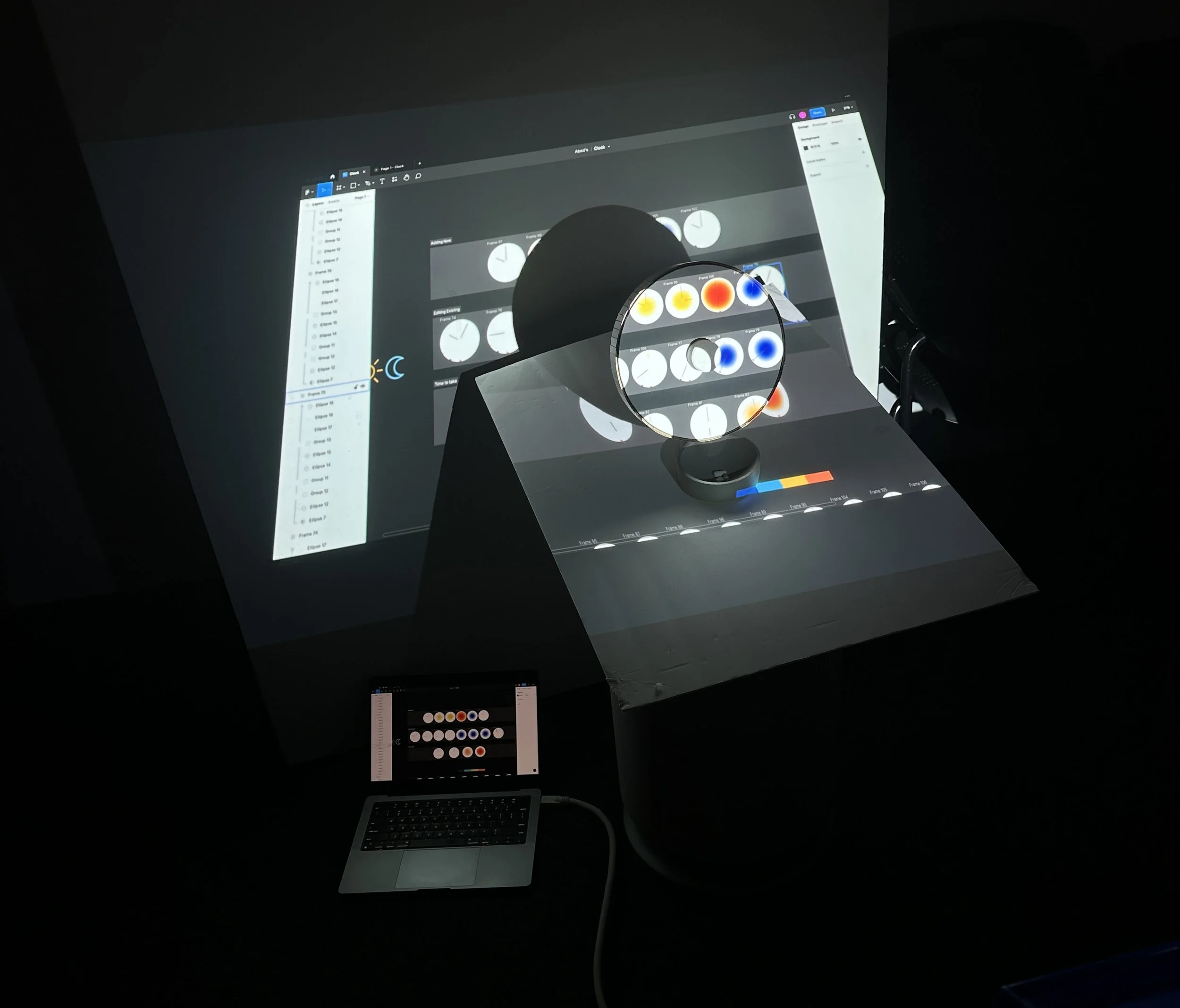
To simulate the smart pill dispenser's functionality, I projected Figma animations onto the clock screen, creating a "Smoking Mirrors" effect. Careful projector positioning resulted in a realistic representation of the device's appearance and function.
Final Prototype
My smart pill dispenser's final prototype includes projection mapping and animations that display reminders and notifications on the clock screen in a visually engaging and intuitive way. Its physical design, unique form factor, and tactile controls provide an intuitive and efficient user-friendly experience.
It’s time!
Visual and audible cues to indicate it is time to take your medication.
Skip the wait
What if you’re heading out early today, just rotate the knob and tap to dispense your pills early.
Need to edit your schedule?
Rotate the knob to select the schedule, hold to edit, and tap once you’re done. It’s that easy!
Next Steps
Having a unique clock shape design comes with it’s own challenges when it comes to adding the pills in the first place, there are some existing pill organizers that utilize a round container but this opens up a new are to explore which is automatic pill organization.
Building the interior pill organizer and exploring ways of automating the organization.
Testing the product on real users.


